


Pop Art is an easy way to bring personality into a room without starting a complete redesign. With its bold colors, familiar images, and playful references to popular culture, it can turn a plain wall into a focal point and give a space a little more character.
Whether you’re decorating a living room, creative studio, or entertainment area, a single striking piece can make a big difference. And you don’t have to fill your home with bright colors to make it work. With the right placement, framing, and furniture, Pop Art can feel just as at home in a sophisticated interior as it does in a playful, colorful space.
Part of the style’s appeal is its familiarity. Pop Art draws inspiration from advertising, comics, celebrities, consumer products, and everyday life. You might recognize an image right away, but the artwork can also make you think about fame, media, and consumer culture. That combination of familiarity and personality makes it a natural conversation starter.
Pop Art also works with a surprising range of decorating styles. It can add a splash of color to a minimalist room, complement midcentury furniture, or bring some modern energy to a more traditional space. The trick is to choose artwork that suits the room and give it enough space to stand out.
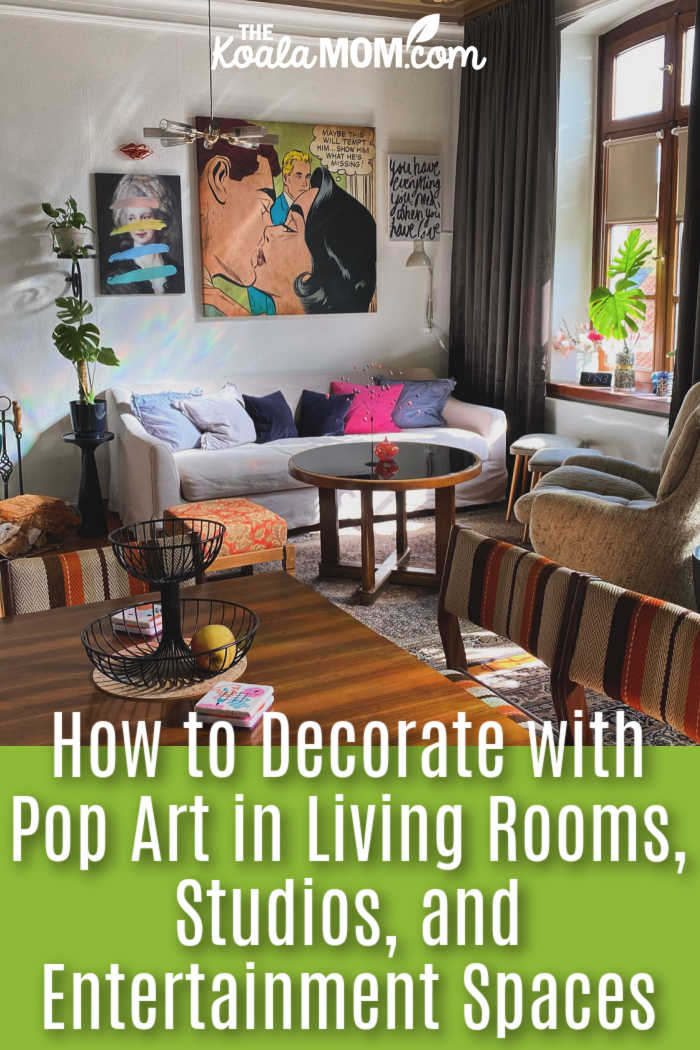
Choosing Pop Art That Fits Your Room
Before choosing the brightest print you can find, think about what you want the artwork to do. Are you looking for a statement piece that draws everyone’s attention, or would you rather create a gallery wall with several smaller works?
A living room with neutral furniture might benefit from a large, colorful print above the sofa. In a busy studio filled with supplies and equipment, a simpler design might be a better fit. Entertainment rooms, meanwhile, can often handle more dramatic artwork because they’re already designed for activities like watching movies, listening to music, or playing games.
The subject matters, too. Comic-inspired prints can give a room a playful feel, while portraits of familiar celebrities might add a touch of glamour or nostalgia. Artwork featuring consumer products can bring a little humor to a casual living space, and typography-based designs can work well in creative studios.
Rather than trying to match the artwork to the room’s purpose too literally, consider the mood you want to create. A recognizable image might become a conversation starter, while a more abstract design can add color and energy without dominating the space.
It’s also worth thinking about the artwork’s size and finish. A glossy print might suit a modern entertainment room, while a canvas could feel more relaxed in a living room or studio.
If you’re comparing different options, iCanvas, a Chicago-based wall art company and online marketplace, offers ready-to-hang artwork on canvas, fine art paper, acrylic glass, wood, and metal. Its collection of Pop Art prints includes options for everything from bold statement walls to smaller decorative accents. Looking at different subjects, sizes, and finishes can help you decide what will work best in your space.
Creating a Pop Art Focal Point in the Living Room
The living room is a natural place to display a favorite piece of Pop Art. A large wall above the sofa, a fireplace, or a media console can provide an obvious spot for artwork that deserves a little attention.
If you’re hanging a print above the sofa, choose a size that feels proportional to the furniture below it. A small picture can look a little lost on a large, empty wall, while a substantial piece can help bring the whole seating area together.
You don’t need to buy oversized artwork to make an impact. The goal is simply to choose something that feels balanced within the room.
Color is another consideration. If your artwork features bright red, blue, yellow, pink, or orange, you don’t need to repeat every shade throughout the room. Instead, pick one or two colors to echo in smaller details, such as cushions, a throw, a ceramic vase, or a few books.
Neutral furniture can help colorful artwork stand out without making the room feel overwhelming. Natural wood, stone, black metal, and textiles in softer tones can also balance the bold graphics.
Pay attention to height when hanging your artwork. A piece that’s too high may feel disconnected from the sofa or console, while one that’s too low can look crowded. Consider how the artwork relates to the furniture rather than relying on a fixed rule about eye level.
Lighting makes a difference, too. Picture lights, wall sconces, or adjustable ceiling fixtures can bring out the colors and details, especially in the evening. Just make sure the lighting is even enough to show off the artwork without creating distracting glare.
Using Pop Art in Studios and Creative Workspaces
Creative studios often have plenty going on already. Whether you’re an artist, designer, photographer, or musician, your workspace might be filled with supplies, screens, tools, and works in progress. Adding bold artwork can make the space more inspiring, but it’s worth thinking about where you put it.
For example, a colorful print might work better near a reading chair or lounge area than directly behind your main workstation. You’ll still enjoy seeing it throughout the day without having it compete for your attention while you’re trying to concentrate.
Pop Art can also provide a welcome contrast to the practical look of a studio. White walls, concrete floors, exposed brick, metal shelving, and simple furniture make a good backdrop for graphic images. Large typography, portraits, and comic-inspired designs can all work well, depending on the atmosphere you’re after.
If your studio has several work areas, artwork can help distinguish them. A bright print near a comfortable chair might mark out a spot for reading or brainstorming, while a smaller collection near your books or materials adds interest without taking over the room.
You can tie the different areas together by repeating a frame color or a few shades from one piece to another. The artwork doesn’t have to match exactly; a little variety can make the studio feel more personal and collected over time.
Bringing Energy to Entertainment and Media Rooms
Entertainment spaces are a great place to have a little more fun with your decorating. A home theater, game room, music room, or media lounge can often accommodate bolder images than a more formal living room.
Pop Art’s connection to popular culture makes it a natural fit. Film imagery, music references, celebrity portraits, retro advertising, and comic-inspired prints can all complement these spaces. Choose artwork that reflects your interests, though, rather than filling the room with every recognizable character or celebrity you can find. A few thoughtful choices will usually have more impact than a wall full of memorabilia.
Lighting deserves extra attention in rooms you mainly use at night. Layered lighting lets you adjust the atmosphere depending on whether you’re watching a movie, playing games, or entertaining friends. Picture lights and adjustable wall fixtures can highlight artwork without flooding the whole room with bright overhead lighting.
If you’re considering LED lighting around shelving or behind a media unit, think about how it will work with the artwork. Reflective surfaces, including acrylic glass and metal prints, can catch light from televisions, windows, and spotlights. Checking the view from your usual seating positions can help you avoid distracting reflections.
You could also create a gallery wall using four related prints arranged in a grid. The repeated layout suits Pop Art’s interest in patterns and repetition. Alternatively, one oversized piece can give the room a strong identity.
Think about how much else is competing for attention. If the room already has a large television, speakers, gaming equipment, and shelves of collectibles, a simpler artwork arrangement might be best. In a more minimalist space, you can let the art take center stage.
Balancing Pop Art with Furniture, Colors, and Materials
One easy mistake when decorating with Pop Art is trying to match every color in the artwork. If a print features five bright shades, you don’t need five matching accessories. Too many competing colors can make the room feel busy and take attention away from the piece you wanted to highlight.
Instead, start with a relatively simple color palette. White, cream, charcoal, warm gray, tan, and natural wood all provide a useful backdrop for colorful artwork. You can still introduce other shades through cushions or accessories, but there’s no need to coordinate everything.
Furniture shapes matter, too. Clean-lined sofas, sculptural chairs, and simple coffee tables tend to work well with graphic artwork because they don’t compete with its bold lines and colors. Midcentury furniture is an especially natural pairing, although you don’t have to recreate a particular period to make the combination work. Contemporary seating and even a few carefully chosen antiques can look just as good.
Think about texture as well as color. Leather can give a room a grounded, substantial feel, while bouclé and other textured fabrics soften the sharp lines of graphic prints. Metal can reinforce a modern or industrial look, and wood furniture adds warmth to a room filled with bright colors and sleek surfaces.
Glass tables and other reflective finishes can work, too, but use them thoughtfully if your artwork already has a glossy finish. The aim is to create a room that feels lively without giving your eyes too many things to focus on at once.
Building a Pop Art Gallery Wall Without Creating Clutter
A gallery wall is a fun way to display several Pop Art pieces, especially if you enjoy different subjects, colors, or styles. The challenge is making the collection feel intentional rather than like a random assortment of prints.
Start by choosing something to tie the pieces together. You might use matching frames, similar dimensions, a shared color palette, or a common theme. For example, several comic-inspired prints can feature different characters and colors while still looking cohesive in matching frames. Alternatively, you can mix unrelated subjects if the artwork follows a consistent size or layout.
Spacing is important. Pop Art often contains a lot of visual detail, so squeezing too many colorful pieces together can make the wall feel crowded. Give each print enough room to stand out.
A symmetrical grid is a good option for a modern living room or media space. If you prefer a more relaxed look, try an asymmetrical arrangement, balancing larger and smaller pieces across the wall.
Before you start hammering nails, lay the artwork out on the floor or use paper templates to test the arrangement. It’s much easier to move paper around than to fill unnecessary holes in the wall.
Remember to consider the furniture underneath the gallery wall, too. A sofa, bench, or console can help anchor the arrangement. You might add a lamp, a stack of books, or one decorative object to complete the look, but there’s no need to crowd the surface with accessories.
If the artwork is already full of bright colors and interesting details, keep the surrounding decor relatively simple. Let the collection do most of the talking.
Getting the Scale, Framing, and Placement Right
Artwork can change how a room feels even before you notice its subject or colors. A large wall generally needs either a substantial piece or a grouping of prints that fills the space comfortably. A tiny picture hanging alone above a long sofa may look out of proportion, no matter how much you love it.
On the other hand, an oversized print in a narrow hallway can feel overwhelming if there’s little room to step back and appreciate it. Consider the wall’s dimensions, ceiling height, nearby furniture, and how far away people will usually view the artwork.
Framing can change the overall effect. Simple black frames emphasize the graphic lines of comics, typography, and photographic prints. White frames offer a lighter look, while natural wood adds warmth. A canvas without a traditional frame can feel more casual and let the image extend across the wall without an extra border.
There’s no single right choice. Think about the artwork itself and how you want it to fit with the rest of the room.
Placement matters just as much as framing. A print might look centered when you’re standing directly in front of it but feel awkward from the doorway or your favorite chair. This is especially worth considering in open-plan homes, where the same artwork might be visible from the living room, kitchen, and dining area.
Try viewing the proposed placement from different parts of the room before hanging anything. If you’re decorating a media room, consider the television or projection screen as well. The artwork should complement the space rather than compete with the main screen.
Making Pop Art Feel Collected Rather Than Themed
A room doesn’t have to follow one decorating theme to feel cohesive. In fact, Pop Art often looks best when it’s mixed with furniture, books, lighting, and personal belongings that reflect the people who live there.
A colorful portrait can sit alongside vintage photographs, a ceramic sculpture, travel books, or an inherited side table. Those different elements give the room character and keep it from looking like everything was purchased as part of the same collection.
It’s also worth resisting the urge to decorate around a familiar image too literally. If you have a favorite celebrity portrait, for example, you probably don’t need matching pillows, figurines, posters, and books featuring the same person. One striking reference can be more effective than a dozen smaller ones competing for attention.
The same goes for comic characters, product imagery, and retro advertising. Let the artwork stand on its own rather than turning the entire room into a themed display.
Most importantly, choose pieces you genuinely enjoy. You might be drawn to a particular artist, a nostalgic image, a bold color combination, or the humor in a design. Whatever catches your eye, personal interest is a better guide than simply following a decorating trend.
Because Pop Art covers so many subjects and moods, it’s easy to build a collection gradually. You can add pieces over time based on what appeals to you, rather than trying to create a perfectly coordinated room all at once.
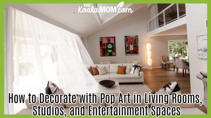
Designing a Room That Can Evolve with Your Artwork
Your taste may change over time, and your home should be able to change with it. One way to make decorating easier is to keep the larger furniture and architectural elements relatively flexible, then use artwork and smaller accessories to introduce personality.
Neutral walls are one option, but they’re not your only choice. Deep navy, forest green, charcoal, and muted earth tones can also provide an attractive backdrop for bright prints. The important thing is to choose a wall color that works with your artwork rather than competing with every new piece you bring home.
It can also help to leave one substantial wall relatively clear. That gives you room to swap a large print for a gallery wall later. Picture rails and thoughtfully placed lighting can make it easier to rearrange your collection, while modular seating lets you change the room’s layout as your needs evolve.
In a studio, movable shelving and worktables can help preserve clear views of the artwork even as your projects change. These small decisions make it easier to keep the room feeling fresh without starting from scratch.
Ultimately, decorating with Pop Art is about finding the right balance between boldness and simplicity. You can embrace bright colors, recognizable images, and playful designs without overwhelming the room. Thoughtful placement, suitable framing, comfortable furniture, and a few well-chosen materials help the artwork feel like a natural part of your home.
Whether you choose one large statement piece or build a collection over time, the best results come from selecting art that reflects your personality. When you combine that personal touch with a little restraint, Pop Art can give your living room, studio, or entertainment space a distinctive look that you’ll enjoy for years to come.
No Responses Yet